

Figure 2 from ‘Part 1’ post
Last week’s post (Part 1) looked at Reno, SFO and Sacramento, three relatively close-by cities at the same latitude but with varying altitude and distance from the coast.
The previous post showed that:
- The three cities differed in their response to warm and cold periods in the last 100 years – anomalies for cooler Reno were higher than for the other two cities during the 1930-1940 ‘warm’ period and lower in the subsequent ‘cooler’ period (Figure 2).
- A cooler average temperature coincided with a greater range of monthly temperatures and variability of temperatures.
- Dropping Reno from the set of three for part of the record could skew the anomaly based average temperature record – increasing or decreasing the warming depending on its inclusion, or not, in the plotted data.
Anomalies may enable comparison of data originating from places with different temperature, but they do not mean that we can forget about them. Are all anomalies created equal? Indeed they are not!
This was a hypothetical case of ‘station drop-out’, using real data. Mostly it illustrated something that should be common sense, but has been conveniently glossed over in the calculation of global average temperature. Perhaps ‘glossed over’ is too mild. The processing of temperature data seems willfully to ignore cyclical multi-decadal effects. Anomalies are different, depending on latitude, altitude, climatic conditions, location etc.

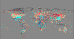
Magnitude of temperature anomalies (L to R): Arctic 64-90N; USA ~30-40N; Madagascar 12-25S
The previous post explored the use of variance as means of estimating the spread of anomalies for each site without directly using temperature or anomaly data. Calculation of the variance (the average of the squared differences from the mean of the data) of the monthly data for each station, produced values with acceptable differences between the stations, representative of their variation in temperature and the magnitude of anomalies. This then had potential as another way to explore the effect, if any, of station drop out on global average temperatures – a sort of parallax view.
Now if I wanted to skew the climate record in some way that was not immediately detectable, I’d be looking for a way to suppress any mid-century cooling, and to ensure I took maximum advantage of the high latitude warming in the Arctic post 1990. Of course I’m not saying there is any deliberate attempt to do this, but there could be inadvertent bias…
Methodology
GHCNv3 data (downloaded 20/05/11 – yes I’ve been sitting on this for a while before completing it) was loaded into an Excel spreadsheet. I chose to use the .qca (quality controlled data) because outliers have been removed and some extreme station moves adjusted. This should reduce the spread of the data overall; if there is bias worth finding it should not have been obliterated by the adjustments since we are looking at variance data not the actual temperatures. I removed the data flags including missing -9999 flag and converted to °C.
The next move was to calculate the variance for the monthly data for each station (variance of all January data; variance of all February data; … etc). This was done using a pivot table and an average of the monthly variance for each station was calculated. Station duplicates were removed and the data was checked for extreme values caused by, for example, very short station records or say 10 years, and such outliers were removed. Records were matched with the inventory data which gave the latitude and longitude of each station etc. and each was assigned to a 5×5 degree grid cell. An average temperature was also calculated for each station.
At this point I should thank Charles Duncan profusely for doing the pioneering work on all of this. Having played around with and learned from his spreadsheets and pivot tables, I started at the beginning and repeated what worked, from the top, to ensure we’d not made an error.
Plotting the average variance against the average temperature value for each station gave the following plot:

For the most part the points on the right hand side of the graph (>20°C) are tropical with relatively high humidity; for example the lowland stations on Madagascar have an average temperature ~26°C and ~0.3 is the average variance. Desert locations tend to be represented by points above the main body of data, with higher variance (representing more extremes of temperature anomalies) than less arid locations with the same average temperature. Chicago (O’Hare) has an average of 9.6°C (variance 4.4) while for Abilene, Texas the figure is 17.0°C (variance 3.0).
Some of the lowest average temperatures also occur in very arid places such as the Antarctic Plateau which do not necessarily have a high variance of temperatures. Generally, points representing cooler annual mean temperatures have a great spread over a wide range of variance. Proximity to water or ocean, variability of ocean currents and weather patterns, as well as latitude and altitude all have their effects and contribute to the year to year variations in temperature and resulting in high(er) variances. Some values for the Arctic region are: Ostrov Dikson -11.7°C (variance 10.5); Gothab Nuuk -1.9°C (variance 5.2).
For the purposes of the intended analysis the following ‘events’ were of interest:
- The warm(er) period in the 1930s-1940s
- The large addition of stations to the temperature record in 1950
- The cooler period 1950s-1970s
- The gradual loss of stations up to 1990 when numbers then fell dramatically
- The warming in the period post 1980 and especially post-1990
A further pivot table was prepared from the original temperature records; this noted only the presence (‘1’) or absence (blank) of temperature data for each year. Due to the size of the pivot table file, the table was truncated, beginning at 1930. Excerpt:

A version of this file was created, substituting the station average variance for each cell (year) in which data was present. An area-weighted version of the data was prepared by creating a pivot table of (Grid)cell vs Data(years), and an area-weighted ‘global average variance’ created for each year. The following is a plot of this data, also plotted with the station count:

To be quite honest, I did not expect to find any difference coinciding so sharply with the changes in station numbers. What this suggests, the drop in average variance in 1950 coinciding with the addition of a great number of stations to the climate record, is that a large number of stations with a relatively low variability of annual temperature were added to the record at this point; and indeed this is the case. A blip is noticeable at 1990, but the biggest surprise was the rapid rise in average variance between 1999 and 2001 coinciding with a further loss of stations. This suggests a possible bias after 2001 towards cooler stations where warming would be more pronounced, with more extreme anomalies.
From the relationship between average variance and station average temperature, a rise of variance from 3.2 to 3.7 represents an approximate average temperature decrease from 8°C to 6°C. On the graph below of average variance against latitude, it is suggestive of a shift of almost 4° north.

Looking at each latitude band individually, the reasons for the abrupt shifts are not apparent:

For the sake of completeness here is the lower part of that graph with a magnified y-axis:

One last thing, and let us suppose anyway that any bias is inadvertent; thanks to a recent post from Paul Homewood I thought to overlay the data on a graph of the AMO index. Look where that 2001 increase in variance lands – right after the AMO flips positive. [Note: the AMO index is correlated to air temperatures and rainfall over much of the Northern Hemisphere.]

Let’s take advantage of all that lovely N. Atlantic warming boys eh? After all we can’t account for the lack of warming now and it’s a travesty that we can’t.
In the immortal words of the fictional Francis Urqhuart (soon to be Frank Underwood in the US rework as played by Kevin Spacey):
“Well, you might very well think that; but I couldn’t possibly comment”

On many climate sceptic sites you hear it said that sceptics don’t dispute that the Earth has warmed, only that any warming is man made. Personally I would only go so far to say that the Earth may have warmed. With the limited data and large potential for errors in its processing and recording, we really can’t tell.
Having spent a lot of time looking at the data, I would agree. I’d expect a small contribution from CO2, however that is likely to be drowned by the natural warming (or cooling). If pushed I would say that most of what we see as a temperature increase is man made, but man made bias, error or change such as UHI or land use change.
OT Will you be making an appearance on WUWT-TV?
Ooh, unlikely. I much prefer to be behind a camera than in front of it 😉
@Verity:
Very well done. The kind of thing I’d thought of doing (hoped to do?) but was not as well equiped to persue. You’ve done it rather well, IMHO. That the effect happens “right on queu” with the AMO swaps is very interesting… might be interesting to compare to PDO as well. IIRC there’s a 10 year difference between PDO and AMO about that 1950 / 60 point that ‘just might line up’ with something interesting…
E.M.Smith
Thank you. I have the PDO graph but it is not as clear cut and as I had nothing interesting to say and the piece was already long I didn’t post it. Will revisit it when I have time. I have a few more things to add but not sure when I’ll get a break from day job deadlines and family mid-term break committments to let me do it.