
Here’s an odd thing. Having experienced such cold weather on holiday in July, I went to take a look at the Met Office maps and graphs, and the UK mean temperature map for July 2015 was a bit of a surprise – it was quite rosy and warm-looking.
 The map of anomalies, however, told a different story:
 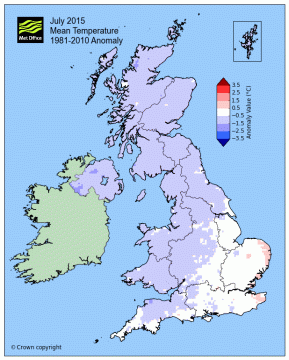 That was more like what I was remembering – colder than normal in most of the country. I suppose most people would forget it and move on. Having checked other months there was a similar picture and I got to thinking about the choice of (actual) temperature range for each of the colour bins.
According to the Met Office summary for July,
“The provisional UK mean temperature was 14.4 °C, which is 0.7 °C below the 1981-2010 long-term average.”
The coldest temperatures in Scotland on the map used the second coldest blue colour bin, the warmest around London used the second warmest red one, but the average temperature falls in the light pink colour for the range 14-16 °C. Would it not have been more honest to use the white colour for the average temperature? The entire country’s temperatures could still have been represented without presenting an overly rosy map.
But this is only one month. Let’s look at a few more. Is there a clear rationale in how actual temperatures are represented by specific colours on the maps, or is there a bias towards an overly rosy picture?


 For August (UK average just below 15°C – light pink bin) actual temperatures are represented by an over dominance of pinks, suggesting warmer temperatures when the anomaly maps tell different story.
For earlier in the year, looking at actual temperatures, you’d be forgiven for thinking January 2015 (UK average just below 4°C – light pink bin) was very warm in Britain, when actually, from the anomaly maps, it was just average.


Conversely May 2015 (UK average just over 9.5°C – light pink bin) looks very warm, when it was much colder than average.


But then these two types of maps are meant to tell a different story. One end of the country is generally warmer than the other and the upland regions in Scotland will always be cold, but how much of the map should be pink or blue, and does it matter? For anomaly maps, the colour bins are standard covering a narrow one degree range, but for actual temperature, the bins are broader covering a two degree range. Still the choice of which bin colour represents the dominant map colour will bias the map. Is there any logic that would explain the choice?
While I think of it – is it not just a little absurd to have dark blue and dark red representing <-6°C and >8°C respectively in January, but <+6°C and >20°C in July. Green and yellow are used successfully on other temperature scales to represent intermediate colours.
“But we’ve always done it that way”
The maps go back to 2001 and, generally, looking at average months, warm months, and those that are colder than normal, the average temperature seems to be represented by that rosy light pink colour. The maps and the bins representing each temperature category tend not to change. That means in a really warm month – the average temperature will jump to the dark pink bin and – yes – the map will be screaming red.
- Jan 2007 – average UK temperature was just over 6°C – colour bin: dark pink (normal January UK temperature just over 3.5°C)
- March 2012 – average UK temperature was just under 8°C – colour bin: dark pink (normal March UK temperature just under 5.5°C)


 What about a few really cold ones – remember December 2009 and December 2010?


![]()
- Dec 2009 – average UK temperature was just over 2°C – colour bin: white (normal December UK temperature just below 4°C)
- Jan 2010 – average UK temperature was just under 1°C – colour bin: white (normal January UK temperature just over 3.5°C)
- Dec 2010 – average UK temperature was just less than -1°C – colour bin: light-mid blue – a ‘coldest on record’ month.
Hehe. These months sure shook things up a bit, actually forcing the use of white as the bin colour for representation of the average temperature. And that is the point – looking at the maps, way back to 2001, generally the map and the colour bins don’t change and the most frequent colour used for ‘average’ is light pink.
I blame that Met Office obsession with climate change.


If they were expecting above average temperatures to become more common, then presumably it would be logical to move the ‘average bin colour’ towards the blue end, not the red, in order to leave more space.
ah but that wouldn’t look as warm and Joe Public might not believe the Global Warming hype.