By Verity Jones and KevinUK
There’s a lot of information available from the climate bun feast in Exeter at the beginnning of September about restructuring and developing a new climate databank and process (Climate Perestroika?) . In the new spirit of embracing openness and transparency (Climate Glasnost?), it is all on the web, but it is frustratingly like watching silent movies – you get the picture but the detail is lost with the sound. However, there are a few bits that are refreshingly familiar….First, the name of their new website (www.surfacetemperatures.org). It is so similar that I originally misread it, mistaking it for Anthony Watts’ www.surfacestations.org. NOAA/ NCDC even used a picture from the Surface Stations Gallery for the title slide of a presentation (as quickly spotted by Anthony himself):

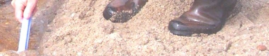
Title Slide from Menne et al presentation at Exeter
Colfax General View of Site (Photo: Russ Steele; Link: http://gallery.surfacestations.org/main.php?g2_itemId=300)
This graph seemed really familiar too…

Slide 12
It is of course so much more scientific looking than my version. And I thought I just had a quirky way of looking at data 😉

Distribution of data trends of raw data vs adjusted data. Original Here: https://diggingintheclay.wordpress.com/2010/01/27/adjustment-effects-on-temperature-trends-part-1/
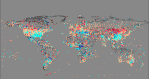
They’ve come up with some nice new ways – non-gridded, non-anomalised ways – of presenting the temperature trends of individual stations on maps too…

Slide 19
Oh wait, that is familiar as well…

And there is more. Kevin has been working on the GHCNV3 Beta data release (ghcn-v3-beta-part-1-a-first-look-at-station-inventory-data) and, gratifyingly it seems as if many of the stations with ‘problems’ as uncovered by bloggers such as Willis Eschenbach (Darwin), and posts here (Edson, Guam) are now ‘fixed’.
Say, you don’t think….? No, no way, they couldn’t have been reading this small sceptic blog surely. It is probably just that great minds think alike, as they say, (but fools…)
But then, one of Dr Menne’s conclusions, reported by Dr. Roger Pielke Senior (here) was:
“Critiques of surface temperature data and processing methods are increasingly coming from non traditional scientific sources (non peer reviewed) and the issue raised may be too numerous and too frequent for a small group of traditional scientists to address” Lessons learnt from US Historical Climate Network and Global Historical Climate Network most recent homogenisation cycle – Matt Menne
And climate blogs are mentioned…

Slide 33
Steven Mosher’s blog is mentioned TWICE and Zeke Hausfather is even lauded with a whole slide summarising his posts (on Slide 34).
It is good to see the efforts of bloggers (what Matt Menne calls ‘non traditional scientific sources’) have had some impact, even if it is not acknowledged. Well this is climate science I suppose so never mind. It’s always good to be in the company of people like Roger Pielke Snr who also didn’t get an invite to the Exeter workshop!
Imitation is supposed to be the sincerest form of flattery, but sometimes that’s all you get, not even an acknowledgement. However we like to be polite, so on behalf of many unsung heroes of the skeptical blogging community – THANK YOU for knowing a good idea when you see it on the web 😉 (Please keep looking!) We enjoy showing you new ways of doing things and delivering you new challenges.
Skeptic Blogs – Keeping Climate Scientists on their Toes Since 2005*
(*Climate Audit was started on Jan 31, 2005)

I take it as a bit of a compliment to be left off the list. It looks like they filtered for those most friendly to their cause and those too big to ignore. I’m happy to be a thorn in the side rather than a rose petal underfoot…
FIWI, as soon as I saw their world map of trend by station I thought of you 😉
Pingback: More dirty pool by NCDC’s Karl, Menne, and Peterson | Watts Up With That?
Nice job Kevin and Verity.
E.M, sorry they didn’t notice your work. It is better than being called by the British anti-terror police. It all adds to the mix though. It still drives me nuts that they keep ignoring my hockey stick criticisms. Whatever.. Maybe I’ll publish em.
Verity
As you know I live near the Met office. If you want to raise an invoice for some of the work and ideas they have filched I will put it through their letter box marked ‘Delivered by Hand.’ Then we can send in the debt collectors.
How do you fancy a re-pocessed computer the size of a football field?
tonyb
Comment from WUWT is also relevant.
It is not that they have ‘fliched’ anything. My observations are just that – in fact it might seem arrogant that Kevin and I even imagine they copied us – which is why I have made light of it, kept it humourous (or tried to). We don’t know, we can’t know. Actually if there is even a remote chance they have got any ideas from us I would feel more flattered than litiginous.
Hi Verity
My suggestion for invoicing was (mostly) facetious but it would be useful to know if the work was lifted or not.
To me both versions of the ‘Outside of the US graph’ look the same but there could be subtle differences I suppose. Do you have any means to take the information in your graph and put it onto exactly the same background as the Met office version then put both side by side?
tonyb
Tony, I know you were being facetious, but one thing I’ve learned on blogs is that there are so many ways to take people’s comments that soimeone will alsways misunderstand, so better to show here clearly I’m not saying anything was filched.
As regards version, my graph was done with GHCNv2 data so it will always look different anyway (and my graph includes USA data). The units on the axes are different also, but then I’ve done various versions but only posted one of them. I’d rather move on an do some new analysis.
To use one of E.M.Smith analogogies, I often feel like I am ‘ploughing new ground’. The thing is I don’t have the intention (time, rigour) to take it all the way, but am happy for someone else to come along pickup on what’s been done, refine it sow and reap a crop. It just would be nice if they used my patch of prepared ground that they mentioned it.
Tony,
I’m about ‘95% certain’ (famous quote from a well known CAGW
alarmist* proponent) that Matt Menne ‘borrowed’ the colour coded individual station trend map idea from thsi blog which is quite I’ve been happy to issue a challenge on WUWT to anyone but in particular Ron B, Nick S, Mosh and the other apologists for CAGW climate science who regular post comments on Lucia’s Blackboard.Unlike our friend Jim ‘we are all going to fry’ Hansen I’ll be hapy to concede that i was wrong if someone manages to find a reference in which anyone at NCDC has included a map of this nature in any of their publications, published before December 2009 when verity and I first came up with the idea of doing this interactive individual station trends colour coded maps. I’m sure Mosh is up to the challenge as he’s very good at finding stuff over at NOAA/NCDC’s web site/FTP server.
Its funny you should ask Verity about Slide 12 as today ‘m working on a replica of Slide 12 now that I have the NCDC GHCN V3 beta dataset loaded into a TEKTemp database. I just got to do with a little issue to do with how they’ve replaced teh normal WMO station code/imod Station IDs with USHCN V2 Station IDs in the station inventory and monthly temperature data files before I can get on to this though.
I think I’ll do a separate thread on the comparison between my replication and their Slides 19 and 20 as it should be very interesting as I’ll be be using their warming/cooling rate ranges and colours. I’ll even increase teh size of the ‘dots’ so that I can ‘smear’ them together just like NCDC do. Thanks for that tip Matt and I promise I’ll attribute it to you. Honest!
*Altered 01Oct2011 in line with new policy: https://diggingintheclay.wordpress.com/2011/10/01/cleaning-house/ VJ.
Verity & Kevin,
Thanks for all your help. While my main interest is energy policy (Brave New Climate) I am teaching in North Carolina in October (NCSU) and this will give me an opportunity to visit Jay Lawrimore at NOAA in Asheville.
I plan to ask him about the station drop off problem. If you have any other issues, please feel free to contact me.
kevin you missed my comment about the priority of your kind of chart.
march 24, 2008. Ken makoff. ( or was it may 24th)
But that not to say they didnt steal it from you, just to say they can always claim inspiration from Ken.
so, do I win the challenge? and I didnt even have to use google as I remember his work.
Mosh,
I’m happy to declare you the winner on this one, but my challenge wasn’t really to find evidence of similar prior work done by others, but rather prior work done by NCDC themselves. Perhaps I mis-worded my challenge? Either way I’m much appreciative of your efforts.
Do you have a URL to the work done by Ken Makoff? I’ve seen your comment on WUWT but couldn’t see any links.
I am aware of not dis-similar stuff done by Alan Cheetham at AppinSys and at WoodforTrees.org
http://www.appinsys.com/GlobalWarming/
http://www.woodfortrees.org/
but I think I’m the first to ‘put it all together’ (raw and adjusted data trends for each station) so to speak in one single interactive map. The DIY Flash based mapping software I use struggles with the amount of XML data it has to load but provided you are patient it does result in a map that can be easily zoomed and panned and is ‘clickable’.
As an alternative to the Flash maps I’m just about to use TEKTemp to generate KML files (for each separate country and WMO regions as well as for the whole globe) with clickable placemarkers that ‘pop up’ bubble windows. People will then be able to download and use these KML files within Google Earth. verity and I are big fans of Google Earth at the moment.
On a longer timesacle I’m also working on getting some of this trend data into GapMinder (remember Mosh you read about this idea here first!). I think once I’ve done this people will be ‘blown away’ as the GapMinder World virtualisation I have in mind will show clear evidence of natural climatic variability within the GHCN raw temperature dataset. If you haven’t already cottoned on to GapMinder as a visualisation tool then you should
http://www.gapminder.org/
http://www.gapminder.org/world/#$majorMode=chart$is;shi=t;ly=2003;lb=f;il=t;fs=11;al=21;stl=t;st=t;nsl=t;se=t$wst;tts=C$ts;sp=6;ti=1820$zpv;v=0$inc_x;mmid=XCOORDS;iid=phAwcNAVuyj1jiMAkmq1iMg;by=ind$inc_y;mmid=YCOORDS;iid=phAwcNAVuyj1gkNuUEXOGag;by=ind$inc_s;uniValue=8.21;iid=phAwcNAVuyj1NHPC9MyZ9SQ;by=ind$inc_c;uniValue=255;gid=CATID0;iid=pyj6tScZqmEfbZyl0qjbiRQ;by=grp$map_x;scale=log;dataMin=294;dataMax=76977$map_y;scale=lin;dataMin=-1.2196;dataMax=26$map_s;sma=58;smi=1$cd;bd=0$inds=;example=6
http://www.gapminder.org/world/#$majorMode=chart$is;shi=t;ly=2003;lb=f;il=t;fs=11;al=30;stl=t;st=f;nsl=t;se=t$wst;tts=C$ts;sp=6;ti=2006$zpv;v=0$inc_x;mmid=XCOORDS;iid=phAwcNAVuyj1jiMAkmq1iMg;by=ind$inc_y;mmid=YCOORDS;iid=phAwcNAVuyj1gkNuUEXOGag;by=ind$inc_s;uniValue=8.21;iid=phAwcNAVuyj1NHPC9MyZ9SQ;by=ind$inc_c;uniValue=255;gid=CATID0;iid=pyj6tScZqmEfbZyl0qjbiRQ;by=grp$map_x;scale=log;dataMin=451;dataMax=73521$map_y;scale=lin;dataMin=-0.9304;dataMax=22$map_s;sma=49;smi=4.31$cd;bd=0$inds=i239_r,,,,,,;i44_r,,,,,,;example=5
Tony,
“To me both versions of the ‘Outside of the US graph’ look the same but there could be subtle differences I suppose. Do you have any means to take the information in your graph and put it onto exactly the same background as the Met office version then put both side by side?”
Your wish is my command.
Mosh,
Do you remember this thread on ClimateAudit? It looks like you do?
and in particular this comment by someone called ‘Mike’.
Now be careful who you pass this info onto as we wouldn’t like those, so far, still active links to become broken now would we as that would look very suspicious wouldn’t it?
I don’t know about you but I often search on ClimateAudit when a new issue is highlighted. More often than not you’ll find that the supposedly new issue isn’t new at all and in fact was discussed and dealt with quite sometime before on ClimateAudit. I’m glad to see that your memory of this thread is better than mine as it would seem we both posted comments on it at the time. I don’t ever recall clciking on any of those links before nor looking at the Google Earth blog link you posted over at WUWT.
Kevin.
As I said I knew of Makoff even before 2008 as he was trying to get a version of GISSTEMP running on the MAC. And yes I knew he worked at Columbia and any connection with Gavin never bothered me.
For myself I did visit kens work in that era as I was keen to get more stuff in google earth. But, the challenge as I understood it was to find a prior source. As I said I didnt even have to use google to recall that Ken had done this work.
The other day somebody called me and said ” hey mosh, there is a mail were Mann discusses the comment policy at RC.. which one is that?”
“megaphone”
What?
“megaphone, search on that word, its the only mail in the stack of over a thousand that uses that word”
Then another guy called me. “mosh, there was this mail were jones is talking to mann about a paper that that somebody at CRU was reviewing. I realize thats not much to go on, but can you help?”
“squeaky clean”
what?
“squeaky clean, that’s the only mail in the stack with the phrase “sqeaky clean” in it.
So ya, I got a good memory. Not as good as it used to be ( google makes you lazy) pretty much photographic, but with age the sharpness has faded considerably. Now its barely a stupid pet trick and it never got me laid.
Anyways, keep up the good fight and don’t take my criticisms too harsh. My main point is this. In the beginning the biggest problem was access to the data and the code. When everybody pounded on that with focus, we got results.
Now that there are more people looking at the issue the focus is absent. We still have people talking on about the station drop out when we know that is not the issue. Complaining about non issues is a horrible tactic.
On adjustments. First they are needed. TOBS for example. We can demonstrate pretty clearly that changing the TOBS changes the temp. JerryB ‘s work over at johndaly old site showed that convincingly. Still, I get people who dont understand it. havent read the papers, havent worked through piles of data as jerryB ( not
a warmist* AGW proponent) and I have.What people MISS when the focus on the wrong problem is a chance to get to the real problem, the tough problem. slide 24. A issue that I’ve been harping on ( alone) for over 2 years. AN ISSUE you can see and point to in the very papers that describe the adjustment. in plain view.
Anyway, the issues surrounding adjustments and homogenizations is not the final output. Nothing follows from the distribution of the adjustments. we know with certainty that they will be warming or cooling adjustments. The issues are:
1. the exact methodology
2. the assumptions of the methodology
3. the uncertainty of the methodology.
Since there is no such thing as “raw” data, since all data is “processed” the goal is to understand the methods, assumptions, and uncertainties involved in every step.
When a thermometer reading is taken by an observer, that very act adjusts the data. the data is taken from a visual form on the instrument and adjusted to a representation on a piece of paper. Even at that stage there are methods and protocals. Anyways enough preaching.
*Altered 01Oct2011 in line with new policy: https://diggingintheclay.wordpress.com/2011/10/01/cleaning-house/ VJ.
Detail, Assumptions and Uncertainty. I agree. Slide 24 was quite an eyeopener.
It is always very much in my mind that there is so much to read, take in and remember. The more you read the more you become aware of what you have not yet read in this field; it can be a killer. The best to hope for is learning from mistakes (self and others) and moving on.
@Mosh: Beware the trap of belief in your own beliefs… We have, at best, some assertions with a couple of types of tests that claim to prove ‘dropouts are not a problem’, but they miss some modes of failure. Interactions with The Reference Station Method and using different stations in the starting grid/box than are in the ending grid box are as yet not adequately explored. Further, there are a lot of folks asserting that since the trends prior to the drop match, the trends after the drop must match, so drops do not matter. One the face of it, that is a broken line of reason. You have no data after the drop from the dropped stations, so there is no way to say if, for example, they have an inverse relationship to the PDO or AMO cycles. So you get a pretty good match from 1950 to 1990, then the PDO flips and the station is dropped. OK, you know exactly what? Not much.
It is that “leap to certainty” about uncertain things that I find most distressing from both the warmers and the lukewarmers. That something ought to be, or that something is arguably a way, or even that a couple of tests show that something might be: None of those PROVE an assertion to be true. I’ve done enough debugging in my life to have learned that codes that “ought to be” usually are not and that things that “just can’t be” often are.
Stations drop. We do know that. They drop preferentially from high volatility places and are kept in low volatility places (mountains and high latitudes diminish, near water and sea level increase along with closer to the equator). That ALONE can introduce a bias to the whole. High volatility stations are most volatile to the COLD direction (as hot air rises and we tend to top out at 100+ F modulo the exceptional odd desert) while cold just puddles up. So we’ve systematically removed the stations that can register extremes of cold during cold times, and replaced them with non-volatile stations. (And then ‘fill in’ the missing cold station with an average of those mediocre stations, adjusted for the average offset, guaranteeing via that average that a real cold excursion will never be ‘created’ as fill in…)
And that is the basic problem with the “we know it does not matter” line of reasoning. You look at one narrow aspect of the data relationship and ASSERT that since it shows no impact, none of the other aspects of the data relationship can have an impact either. Even though the codes, like GIStemp, use a different set of calculations on the data and are subject to those other modes of failure. (Such as using an average to ‘fill in’ a missing value, that can never find an extreme cold excursion).
So feel free to explore whatever line of research you find interesting, but please, do NOT tell the rest of us what we may look into. I’ve already benchmarked a 1/10 C warming of the data from one broken line of code in GIStemp and an overall (roughly) 1/2 C warming of the data prior to the grid/box anomaly formation. Given that those are about the magnitude of the “problem” with “global warming”, I think that is sufficient cause to keep digging.
(Frankly, that warming prior to the grid/box is worrying. We have folks all over the place saying that anomaly processing makes everything just fine, but in GIStemp the grid/box anomaly is calculated after a boat load of other machinations that include a ‘fill in’ homogenizing step and a ‘splicing’ via blending data from ‘nearby’ stations and combining stations. Splicing a bunch of data together is known to ‘have issues’ even if you call it ‘combining’ and ‘homogenizing’ instead. Doing it with colder and more volatile stations in the past and warmer less volatile stations in the present is, IMHO, not shown to be a valid technique. And yes, I’ve read the paper. It is inadequate to support the degree to which the technique is used, both over time and over space along with repeated serial applications…)
@jeff Id: Thanks for the vote!
FWIW, very early on I stated my purpose was to rough plough the field and let others find bits worth exploration. (Though somehow the warmers have felt free to attack on the basis that I’ve not worked some point to a polished finished product.) And I’m glad to see Verity picking up the meme. So I ‘ran fast’ over things and turned up interesting bits. Saving a lot of other folks the search time. Not exactly the kind of stuff that gets you “noticed” in citations. And I’m fine with that. Never was a glory hound. (Even if the occasional bit of notice does feel good 😉
Oddly, having started at what I now think is the wrong end (GIStemp, that does skew the results, but is not the ‘root cause’, just an amplifier with odd ‘interactions’ with the root causes) and worked my way backwards into GHCN (that embodies the root causes, yet is not the actual creator of them), I’m reaching a point of being uninspired about which way to turn the plough next…
To dig more in GHCN and GIStemp is more a ‘polish the work’ process. Yes, needs doing. Yes, probably more to be done (such as defend against some of the attacks along with measuring the actual impacts of each ‘oddity’). But that’s not “rough ploughing”, so I’d need to shift my mindset…
There is clearly a dramatic impact from the station / process changes done between about 1987-1992 (and a simple look at when each station “mod flag / duplicate number” changed vs what happened then would focus on what “it” is…). The dramatic clipping of low going excursions in the monthly “hair graphs” is just stunning. (I suspect that the MMTS is not suitably calibrated at low going excursions, but that’s just a bald assertion. Then again, I’ve seen at least one test of the equipment that showed significant error on low excursions and the error was to the warm side.) The high temps don’t get higher, but the low temps get clipped. Not exactly what I’d call ‘global warming’…
That change feeds into the impact from ‘dropped stations’ and could easily be the ‘why it matters’. Perhaps it was a change from LIG to MMTS or a change of QA? I’ve done the detail work on one station pair that shows the dropped station not warming and the kept one warming ( 60 miles from each other, well inside Hansens 1200 km …). But that will take an order of magnitude more effort (and data) as it requires backing upstream one more step into the dailies and I’m just not ambitious enough for that as a part timer. (If I didn’t have to make the house payment by ‘other means’ I’d be all over that line of research, as I think that is THE key to the hockey blade post 1990…) Add that I’ve not got a source of machine readable dailies, where a ‘professional’ funded in the field would have them, and there just isn’t the leverage for a ‘rough plough’ on that transition in the dailies.
So at this point I’m taking a wee bit of a break as I try to figure out which way to turn the plough next, or ought I to start planting and weeding with everyone else 😉
Decisions decisions…
But at the end of the day, I’ll be happy just to sit at the dinner table with everyone else and let each person talk about the fine squash, the great potatoes, and the wonderful parsnips they have grown. Even if unspoken, I’ll know that prepping the field and showing where there were rocks and where there was loam will have helped in some small way.
And frankly, the cool presentation work done by Verity and Kevin are the things that need to be lauded. That’s where the communications and impact is to be found.
FWIW, I like your hockey stick criticisms 😉
I do find it rather interesting that the shape keeps showing up as a flag of where error is to be found. It’s even in the GHCN data if you do ‘self to self’ anomaly processing (where a given thermometer is compared ONLY to itself to create an anomaly as the very FIRST step). That is so suspect. So anything that makes the Hockey Stick more iconic of “bogus result” is to be encouraged, IMHO!
Ha! I used that agricultural analogy (learned from you – it is so apt!) a few days ago (here? – oh dear I don’t remember). If you broke the sod and turned it with a plough, perhaps we’ve moved it on here by harrowing. It is still early days.
Mosh,
“But that not to say they didnt steal it from you, just to say they can always claim inspiration from Ken. ”
Thanks to you clue I’ve ben able to find Ken Mankoff’s original Goggle Earthe KML files and have now replicated his work, bringing it up to date so to speak. In brining it up to date I’ve used teh GHCN V2 and also GHCN V3 beta datasets and have used the colour coding scheme I’ve used on my Flash maps.
I’ll have the TEKTemp outputed KML files available for downloading from http://www.climateapplications.com for use with Google Earth shortly. Ken was clearly ahead of his time back in 2008. Interestingly I found his data via an old thread on ClimateAudit that both you and I had commented on, but I clearly have a lot worse memory than you as I can’t remember the particular thread at all. I’d now like to finish teh job Ken startd by providing an interface between the Google maps placemarkers and teh station meta data and photos on surfacestations.org
Anthony has a good outcome to this by simply asking Menne to attribute the slide: