
Guest Post by Charles Duncan
Between 1970 and 2000, global average temperatures (as measured by weather stations and satellites) showed a steady increase, leading to forecasts by some of catastrophic climatic change.
However data from weather stations (before the satellite era) showed that temperatures had fallen steadily between 1940 and 1970. Indeed there was considerable concern in the 1970s that Earth was about to enter another Ice Age. Most climate reconstructions show the most recent decade to be the warmest, the 1930s were a particularly warm period, with many temperature records broken, few of which have since been equalled.
The American Global Historical Climate Network (‘GHCN’) is one of the most respected climate databases, and constitutes the major part of the HadCRUT[1] temperature reconstruction on which the IPCC’s reports are founded. Their most recent data release – “v3 beta” comprises data from a total of 7280 stations going back as far as 1701.
7280 stations reporting monthly for 309 years should give nearly 27 million data points; in fact there are only just over 5 million, so real data is present for less than 20% of the time. For the last 100 years the situation is better, but data is still only present about half the time; roughly 4.5 million data points out of a possible 8.7 million. Computer programs have been developed to ‘fill in’ missing months from using averages (anomalies) where possible.
Averaging the temperature across the globe with such variable data is a challenge. If one simply took the average temperature of stations reporting in a year it would be affected by the stations that had been added and dropped. For example, if one year a station in Central Africa was dropped and one in Greenland was added, the switch would lower the average temperature. To minimise (eliminate?) this problem, the temperature change – or ‘anomaly’ – from one year to the next, rather than actual temperature, is used. By summing the average of the anomalies one then reconstructs the time series.
Having said that, there are instances within the GHCN database where the profile of the stations changes dramatically and looking at the “shape” of the data is important for any data set prior to analyses. For example, in 1989 there were 3634 stations that reported for a full year; these had an average temperature of 11.37°C. In 1990 there were 2990, with an average temperature of 13.44°C. Most of this massive leap comes from the adding of 321 stations with an average temperature of 15.25°C, and the dropping of 965 stations with an average temperature of 7.32°C. As the entire claimed 20th century warming is substantially less than one degree, it is hard to believe that such fundamental changes to the profile of the database do not compromise the fitness of the GHCN record to measure such small differences.
Of greater concern though, is the fact that sparsely inhabited parts of the globe – such as the oceans (which constitute 60% of the planet) and the polar regions – have few stations. In contrast, the USA has about 25% of all the weather stations, yet covers only 2% of the planet.
To address this, the station data is ‘gridded’ into cells of typically 5 degrees latitude and 5 degree longitude. The average anomaly for all the stations within that cell provide one value, and the average of all cells is the global average. As with ‘missing months’, programs have been also developed to ‘fill in’ empty cells, but the algorithms used affect the result.
This is significant, because most cells have no stations at all; indeed only about 20% of cells have any data in any given year. It isn’t so much filling in the missing piece of the jigsaw as trying to get an idea of the scene with only a fifth of the pieces!
It is further complicated by the fact that Suburban and Urban stations have their data compromised by what is known as the Urban Heat Island Effect (‘UHI’); in essence towns and cities can be shown to be significantly warmer than the countryside around them. The magnitude of this difference and how much should be corrected is still the subject of debate.
Amongst the reasons for this are the fact that in cities we consume a great deal of power (oil or gas for heating, fuel for cars, electricity etc) and all this ultimately ends up as heat. Furthermore many building materials (such as tarmac and slate roofs) are dark and absorb sunlight better, getting hotter in the process. These materials are also generally impervious, and rainwater falling on them is diverted to drains and out to sea. In contrast, when rainwater lands on grass and is absorbed, it subsequently evaporates and in doing so absorbs a huge amount of energy in the form of latent heat.
To eliminate the UHI effect, it is best to look only at rural stations. However, if you think having only 20% of the cells with data is a problem, narrowing it to those cells with rural data exacerbates it; less than one in 7 cells has any rural data:
 The extent of in-filling of missing data has raised claims that much of the recent warming is actually a manifestation of the data handling (or even manipulation), rather than being present in the raw data. To illustrate why this claim persists, an ‘apples-to-apples’ analysis was conducted, comparing the 1930-1939 mean to the mean of 2000-2009.
To get the most comparable data, we used only those stations that had full data (i.e. 12 months per year) for all the years in both the 1930s and 2000s. Only 430 (6%) out of the original 7280 stations fulfil this criterion.
Because we were using the very same stations in both decades (with no drop-outs or add-ins) there was no need to calculate anomalies; rather we simply compared the average temperature of all stations.
| 1930s average | 2000s average | Change between 1930s & 2000s | |
| Rural (154) | 9.944°C | 9.869°C | -0.075°C |
| Suburban (93) | 12.122°C | 11.954°C | -0.168°C |
| Urban (172) | 13.077°C | 13.540°C | 0.463°C |
| Other (11) | 9.093°C | 8.688°C | -0.405°C |
The result was perhaps a little surprising; the average temperature from 2000 to 2009 was lower than the average temperature from 1930 to 1939 for all station types except Urban.
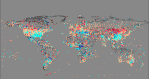
There are no prizes for guessing the distribution of these stations and why it is that the spatial location of the data is taken into account when a ‘global average temperature’ is calculated:

Map showing the approximate location of stations in GHCNv3 beta with data in both 1930-1939 and 2000-2009 (Key to symbols: White = Rural; Blue = Suburban; Red = Urban)
The distribution of these stations is very heavily weighted to the USA, especially for ‘Rural’ stations:
 With so few stations – 154 rural in 55 cells (just 2% of the planet) – it did not seem feasible to do any meaningful gridding, but the facts are as they are: the average of rural stations that reported in the 1930s and 2000s show the former period to be warmer. That said I did take a look. The decreases were more clustered than the increases, and the gridding (without making a compensation for the different areas at different latitudes) resulted in a delta of +0.21°C, still way lower than the generally published delta.
Does this analysis prove conclusively that the 1930s was the warmest decade? No, but it is arguably a ‘purer’ comparison than many others.
[1] An acronym of the “Met Office Hadley Centre for Climate Change”, “Climatic Research Unit” at the University of East Anglia and “Temperature”

First, if there is “global warming” one might expect for it to warm in the United States. The relatively more dense coverage of stations ought to make the result show better than in a hodge-podge of sparse places.
Second, just the added, dropped, fill-ins, moves, instrument changes, and reporting time changes (what have I missed?) are enough to cause one to question whether or not the data can tell us much of anything. This list of stations has grown (or not) for local reporting, and was never established as a “system” with an integrating (summarizing) purpose. Your reporting of this is a useful contribution, even without the temperature data ever being looked at.
Third, you say “. . . as the oceans (which constitute 60% of the planet) and . . .”
This has little to do with your main argument, however, even as round numbers this doesn’t seem appropriate. The total ocean is often cited as 70.9 % and deep ocean (200 metres and deeper) as 66%.
http://en.wikipedia.org/wiki/Ocean
Nice post. Thanks.
(SarcOn) Things are just sooooo confusing and unreliable that we reallllly fo need to throw the old stuff out the window and start all over. Once we finally do that we need to take impecable records for at least ten or twelve variables and revisit the matter in say 100 or 200 years or so. There’s NO other way!(SarcOff)
The dominance of weather stations in the USA makes a mockery of the idea that NASA/GISS, NOAA/NCDC and HADCRUT can be relied on to show global trends.
We should use the US ground stations to calibrate the satellites. The satellites should be regarded as the “gold standard” for measuring temperature anomalies on a global scale.
Much as I prefer to use data with no missing months, it would be interesting to lower the quality control on this to look at additional stations.
Charles
“7280 stations reporting monthly for 309 years should give nearly 27 million data points; in fact there are only just over 5 million, so real data is present for less than 20% of the time. ”
Like you I’ve analysed the NCDC GHCN data in a lot of detail but I never thought to derive this particular very revealing statistic so thank you fro this thread Charles.
I think this shows just how ludicrous the idea of deriving a mean global surface temperature anomaly for the whole planet is. We are supposed to belive that its ‘robust’ that the late twentieth century warming period is ‘unprecedented’ when in fact we aren’t even in a position to accurately compare the 1910 to 1940 warming period to the 1970 to 2000 period because has Charles has shown we just don’t have enough data, let alone that what we do have is of sufficient quality fro it to be used to make reliable policy decisions.
Having said that I agree with you gallopingcamel, what data we do have that could possibly be considered to be of sufficient quantity and quality is the US dataset. If we must attempt to calibrate the satellite data, then I’d agree that probbaly the best we could do is calibrate relative to the US land surface temperature dataset post 1979. What a pity it is that we only entered the satellite age in 1957 as if we’d had satellite data back in 1910 to 1940 then I’m pretty confident that the current CAGW scam would have been revealed much early if not avoided altogether.
I think this is even more damnimg:
“For the last 100 years the situation is better, but data is still only present about half the time; roughly 4.5 million data points out of a possible 8.7 million.
Yes Charles has thrown up some very interesting stats. It does make me want to investigate further.
Pingback: 2011 global temperature thread - Page 7 - US Message Board - Political Discussion Forum
Could Charles- or anyone else here- confirm how many REAL and how many interpolated data points there are for sea surface temperatures to 1860?
I made it less than 3 million which for an area covering 70% of the planet is around the same number of data points as in CET (although not ALL of those are real?
tonyb
@tonyb: Central England Temperature is a single series going back to 1772, it’s about 90,000 datapoints (for daily mean, say). You know that. So what dataset did you mean to mention?
Hi drj11
Manley in his original 1953 paper -and subsequent extensions to take it back to 1659- used data from around 12 stations plus various other individual records. Some of these recorded up to three times daily, several took hourly readings. during the day and once or twice during the night.
Over the entire 350 years this comes to something between 2 and 3 million data points.
Cet has many problems but merely illustrates that even with x million data points the results over a tiny portion of the Earths globe are in question (methodology, locations and instrumental inaccuracies)
My point was to ask if anyone knew the precise number of SST’s data points back to 1860 used in the official records. The methodology and equipment were wildly inaccurate yet we are asked to believe we know the SST of the globe back to that date based on a relatively tiny number of nonsensical readings.
tonyb
Sure, sure, if you want to count it like that.