
I’ve been silent on BEST so far. I still have not read the papers or looked at the data. I’m barely keeping up with so much being written about it. New posts on station data analyses have been absent for a while too, the main reason being that I don’t have time for the rigour required to check and finish analyses to the standard required for a post. However, I am intimately acquainted with the SHAPE of the station data that makes up the GHCN data sets.
A current post by Anthony Watts – Uh oh: It was the BEST of times, it was the worst of times strikes a chord with what I’ve wondered about in relation to urban temperatures. This graph is an overlay of a GISS data for Los Angeles and data from BEST, plotted by Steve McIntyre. Glad to see Steve is on the case, big time it seems (Some BEST Tools and subsequent posts).

Overlay of two data sets for Los Angeles combined to fit scale and time. Source: http://wattsupwiththat.com/2011/10/29/uh-oh-it-was-the-best-of-times-it-was-the-worst-of-times/
So this is a city cooling when we argue about Urban Heat Islands, cities warming faster than the surrounding rural areas, and whether or not there should be compensation for UHI in global temperature calculations. To quote Steve McIntyre:
“The degree to which increased UHI has contributed to observed trends has been a longstanding dispute. UHI is an effect that can be observed by a high school student. As originally formulated by Oke, UHI was postulated to be more or less a function of log(population) and to affect villages and towns as well as large cities. Given the location of a large proportion of stations in urban/town settings, Hansen, for example, has taken the position that an adjustment for UHI was necessary while Jones has argued that it isn’t.”
What I want to know is, if GISS does adjust for UHI and CRU doesn’t, how come the graphs produced by each are almost identical in the rate and extent warming shown? This is cited by Steven Mosher, Zeke and others in area weighted replications of Rural vs Urban data and Unadjusted vs Adjusted that the adjustments make little difference because the warming is ubiquitous (See Climate Parallax for example), and I will be, at best, called naive for still thinking they do.
Let me go on record now in saying that nothing I have seen inside the data sets derived from GHCN convinces me that the warming we are being told is happening is in any way catastrophic. In fact, for the most part, changes in temperature of the stations and their surrounding areas and ‘nearby’ stations (in some cases >1000km away), can be related to urban change, land use change, or badly accounted for station moves (which one hopes will be corrected for). The problem is, at the moment, there is too little attention paid to this due to the enormity of the task, our lack of agreement in how to do this accurately (if we can), and people saying it doesn’t matter and won’t make any difference.
Actually the cooling shown by Los Angeles doesn’t surprise me (see In search of Cooling Trends (many of the stations were cities), and Cherrypicking in Bolivia). I’ve come across this before and I can see a mechanism for how it might occur that some cities cool while others are warming more than their surroundings.
While the current furore is mostly about the last decade, I also have my eye on a similar effect in the middle of the century. Take Oslo, capital of Norway for example:

GIStemp: Unadjusted data for Oslo Blindern
There is strong cooling from the 1940s, despite continued population growth of the city. How could this be? The Blindern site is located at University of Oslo, and has a known, well documented history going back to the early 1800s in the middle of the city at the top of Oslo Fjord. It is a compact city, bounded by the sea and surrounding mountains; it has grown by spreading, fingerlike, up valleys and down the shores of the broad fjord.
Oslo Blindern might be an example where city growth and UHI developed early in its history, then stayed relatively static. Due to its latitude, the need for good insulation and lack of need for air conditioning would not have seen significant additional ‘heat dumping’ into the city due to technological growth in the post-war period. Perhaps this is a truer estimate of temperature in the latter half of the century than at some nearby warming stations, but I am only speculating.
Homogenisation with surrounding stations, which are generally warming, reduces the cooling but it is still there:

GIStemp: Homogenised data for Oslo Blindern
In fact homognenisation by GIStemp does this to a lot of cooling stations, when the surrounding stations may in fact be warming due to early stage UHI and/or land use change. BEST also homogenises and Doug Keenan suggests this effect too in his correspondence with Richard Muller:
“Considering the second paper, on Urban Heat Islands, the conclusion there is that there has been some urban cooling. That conclusion contradicts over a century of research as well as common experience. It is almost certainly incorrect. And if such an unexpected conclusion is correct, then every feasible effort should be made to show the reader that it must be correct.
I suggest an alternative explanation. First note that the stations that your analysis describes as “very rural” are in fact simply “places that are not dominated by the built environment”. In other words, there might well be, and probably is, substantial urbanization at those stations. Second, note that Roy Spencer has presented evidence that the effects of urbanization on temperature grow logarithmically with population size. The Global Average Urban Heat Island Effect in 2000 Estimated from Station Temperatures and Population Density Data
Putting those two notes together, we might expect that the UHI effect will be larger at the sites classified as “very rural” than at the sites classified as urban.”
Put simply, homogenisation ‘averages’ the trends; the data is ‘messy’ and homogenisation is meant to ‘tidy up the mess’ (for an expert view start here), but in doing so there is some decision as to which sites are adjusted and by how much. Without looking at stations subjectively to ascertain if anything that changes with time (other than CO2/climate change) could be affecting temperature (quality is everything), putting them in categories – urban, rural, very rural – and treating them objectively (as science dictates – see objectivity) is useless.
Why I think this is important.
Dr Judith Curry had an interesting point in her presentation to MIT Climate Science and the Uncertainty Monster:

Slide #35 from Judith Curry's MIT "Uncertainty Monster" presentation
At the time I was interested in differences between the NH and SH, but just look at the rate of cooling between 1940 and 1970. It’s very small, but then this is land and sea surface data. Here is the GISS data for meteorological stations (land) only:
")
Land data only. Source: GISS http://data.giss.nasa.gov/gistemp/graphs/
An estimate by eye of the cooling gives approx. -0.6°C/century cooling trend between 1940 and ~1970. And I’ll say again – if GISS does adjust for UHI and CRU doesn’t, how come the graphs produced by each are almost identical in the rate and extent warming shown – and the small degree of mid-century cooling? With more data and different homogenisation, I note the BEST graphs are close also.
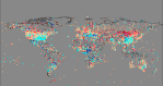
When you look at the actual data stations with a cooling trend in this time period seem to outnumber those with a warming trend. You can see this below on a map from Kevin’s January 2010 post Mapping Global Warming. (The key to the colours is here – note the palest blue is cooling of 0.0 to -1.0°C/century and the darkest is -4.0 to -5.0°C/century):

GISS - Trends of unadjusted data for the period 1940 to 1969.
Adjustment/homogenisation produces more orange dots and fewer blue ones. Combining and spatial weighting of the data results in the GISS graph above. This goes back to my point about Oslo Blindern and many other stations, and I infer no malicious intent, but the adjustments do seem to have a cancelling effect. Perhaps it is unintentional and inadvertent, but is this yet another way to ‘hide the decline’?
I acknowledge it is entirely possible that adjustment and correct UHI correction will make no difference, but I remain to be convinced.
Update – now this graph overlay from Frank Lansner shows a perfect example of why I have such concerns.The original post is here:

Overlay of RUTI ("Rural Unadjusted Temperature Index") data over that from BEST

Verity,
This thread realy should be on WUWT so that it seen by a much wider audience.
Like you i also think that the 1940 to 1970s cooling period doesn’t receive the attention it deserves.
As with the MWP and LIA it is a very inconvenient period for the climate modelers and means that they have to invoke aerosols to try to explain this cooling period. We are supposed to believe that the rapid industrial expansion during and after the Second World War up until the introduction of the Clean Air Act suppressed what would otherwise have been a rapid underlying warming trend.
If that was the case then where were all the aerosol spewing smoke stack filled industrial plants in the South East USA, North West Canada, Northern Russia and Central China (i..e the dark blue dots on the map)? Clearly ‘clean’ fossil fuels were adopted much earlier in the Russian Caucasus, Asia Minor and Japan than elsewhere in the world (the red dots on the map). And look at all those pollution spewing plants in the southern hemispshere in Argentina, Southern Africa and Eastern Australia (NOT!).
I agree with you (and Frank Lansner BEST v RUTI amply shows it), that they are clearly trying to suppress the significanace of the widespread global cooling period that occurred between 1940 to 1970 as it is very clear evidence IMO of significant wholely natural ocean circulation driven cooling despite the rapid increase in anthropogenic CO2 emissions during this same period.
KevinUK
This period is another of the cornerstones of climate science. The fact is that there WAS a global cooling scare.
Many people have tried to play down this period-for example William Conneley-with articles trying to illiustrate that it was all our imagination and virtually no one other than a few rogue newspapers thought anything was amiss.
I’ve got a rebuttal to Conneleys article in preparation but it will have to wait its turn behind ten others, unless that cheque from Big oil arrives soon and allows me to concentrate full time on unpicking the wilder nonsenses of the AGW proponents .
tonyb
Verity,
Thank you for putting the spotlight on this. Take a look at BEST-prosjekt Blindern, Norway, and the official temperatures from Meteorologisk Institutt (Norwegian Met Office):
http://klimaforskning.com/forum/index.php?action=dlattach;topic=202.0;attach=696;image
Jostemikk,
thank you for that image link. Sorry I didn’t notice your comment earlier. It was caught by the spam filter which I only check every few days.
@Kevin
Thanks for the encouragement. I have it in mind to condense it slightly for WUWT, but as ever too many other priorities.
@Tonyb
It is important not to let this cooling period get swept under the carpet. It happened. The reasons suggested to explain it (e.g. sulphur) don’t hold up. It is worth much further scrutiny.
Verity
I see that a Steve Mosher is getting onto you at WUWT- ignore him…
Oh don’t worry. Mosh likes precision and likes to see intelligent debate (not that he’ll necessarily get that from me ;-)) rather than inane comments over at WUWT. I don’t blame him for that.
Verity
As it is more topical I am more interested at present in the current ratio of cooling/warming stations of 30/70%
If either you or kevin were able to supply me with say 20 of the most strongly warming places (according to BEST) I will have a look at their background. This would be tied in with BESTs silly notion that Uhi demonstates a cooling effect so a good proportion of the 20 should be urban.
(sorry, I have no way of finding this info for myself and assume that either you or Kevin have the means to do a selection)
tonyb
Tony,
‘fraid I haven’t downloaded BEST data. I am not even sure if I am going to – too many other priorities outside of climate analysis and blogging these days.
Verity
The more we learn about the poor quality of even the siting data of these thermometers, the more I question the certainty with which people opine on how small the UHI effect is. Common sense, plus the maps, show that thermometers are mostly sited where people are. The great expanses of wilderness are very under-represented in the data – the Argentine pampas, the Patagonian Gran Chacos, Canada, siberia, central australie etc etc. Therefore, any consideration of UHI has to start with the acceptance that the record is full of UHI impacts.
Maybe it would be instructive to look at the 1/3 of locations that show a cooling trend and work out how they differ from the others. Maybe there needs to be a proper reconciliation between the satellite measurements and the thermometer ones. I just find it odd that people are so quick to draw strong conclusions on such shockingly bad data.
The UHI effect is easy to measure at a given time and place, but the challenge is understanding how that differs over hours, days, months, weeks, seasons and years of weather, and then how those differences change with time. It is easier to say it is negligible because, as you say, human influence is so widespread. What is difficult is teasing out where it affects, which is painstaking; most people want to paint with a broad brush and gloss over the fine detail.
Pingback: Examining Urban Heat Islands – Part 2 | Digging in the Clay